Tuesday, July 14, 2020

Be strong...

I spent hours making a card on Saturday.  It's really a treat to have that much time for crafts, though it never ceases to amaze me how long it takes me to make anything! 

I like the card.  It came out nicely, and I'm going to put it in the mail today, but when I look at it, it looks fun, but unremarkable.


What actually does make it remarkable for me is that so many things successfully came together to make the card possible.

1.  The idea.  I happened to catch a card posted by Coffee Loving Card Makers on Facebook or Instagram, I can't remember which.  The card is by Richard Breaks, a crafter I just started following.  He used this sentiment built from a Honey Bee Stamps set called Perfect Blend.  I was struck by the simplicity of it.  Be Strong, be bold.  To my mind, it's a perfect pairing with coffee-themed cards.  With all of the coffee and tea-related stamps in my collection, I've been wanting to make more coffee cards for ages.  So an idea was born.

2.  The card shape.  Slimline cards are a popular new/old idea in the card-making world.  I'm not completely sold, but I wanted to try a few - lord knows I have plenty of business-sized envelopes to send them in.  I liked the first one I made...


...but I didn't even take a picture of the final version.  The kitties themselves were fun and easy to make, but cutting the layers was a nightmare of not quite straight or perpendicular lines.  This is why I buy frame dies - they take the guesswork out of cutting layers, and increase the chances I will like something I make.  After struggling with my kitty slimline card, I bought a set of slimline dies from Trinity Stamps.  They arrived on Friday, and part of making this coffee card work involved testing the dies.

Now, I sometimes have an adversarial relationship with my die cutting machine, but I've figured out how to make it work most of the time, even though I hold my breath every time I send something through.  The thing is, the machine is small-ish, and has cutting plates that are almost, but not quite long enough for the new slimline dies.  Yes, I could do partial die cutting and run the stuff through the machine twice, but that adds to the likelihood that something will go wrong.  But this is me, who hangs onto things long after she should.  I saved my long Cuttlebug cutting plates that hardly ever got used in the long-gone machine because I thought they might be useful someday.  On Saturday,  I dug out the almost pristine long plates, played with the arrangement of plates and shims until I got my slimline dies to cut in one pass.  Victory!

3.   Stamps and dies.  I knew I wanted to use big coffee cup images for the card.  Since I have most of my stamps cataloged and tagged in an online database, I simply plugged in the keyword "coffee", picked out a few likely candidates, and compared the size of the images to the size of the three card windows.  I landed on this set from Cat's Pajamas called This Could Be Vodka.

Most of the time, when I buy a stamp set, I buy the matching dies.  I struggle with fussy cutting out an image the way I struggle with cutting straight lines for card panels even with a paper cutter, ruler, and everything else.  For all two of you who read my last post which touched on this topic, my chosen set for the coffee card had no matching dies for the full images of critter plus cup - no physical dies, that is.  But I actually found and bought an on-sale digital cutting machine about a month ago, and last week, bought (for zero dollars!  Hooray) the digital cutting dies that matched.  I'd been nervous about trying the digital dies the way I'm nervous about trying many new things, but I'd rather try than have the machine sit around and collect dust.  And wouldn't you know, after watching many tutorial videos over a few days, I uploaded the cut file, chose the correct settings for the paper I was using, and the dies cut perfectly.  Victory!

4.  Coloring.  Another thing I work at, but am less good at.  As I was getting excited about my digital dies actually working, and getting my stamps all lined up and stamped out, I was thinking about how to color the cups and the critters.  As I was clearing up some scraps on my work table, it occurred to me try paper piecing patterned paper onto the cups.  As it happens, I do have dies that match the cups only, so I took a quick wander through my endless amounts of paper scraps, and found a piece of patterned paper that came with a magazine I bought years ago, and cut out some cups.  And even though it's not a palette I gravitate toward, I found a coordinating color for the mat behind the windows and a matching marker to use for the cup handles.  I made the bold choice to keep the critters white.  I'm fine with that decision.

If there's one thing I would change on the card, it's the sentiment.  The two sentences should at least be closer together.  If I end up doing a coffee card series, I might use the same sentiment again, so I'll have a chance to play with design and placement.

Wednesday, June 24, 2020

Woodblock Wednesday - Tea Edition

Ever since I finished my mail art project, which I failed to write about, but still may, and the first round of my pocket letter project, which I also failed to write about, but still may, I've renewed my focus on craft room organization and unmounting my woodblock stamps.  I mean, it's really a space problem in the end.  I have my woodblock stamps stored in Moppe storage boxes from Ikea (from back when they were solid and sturdy), and they just take up a lot of space.  Based on rough calculations, one Moppe box fits about 60 woodblock stamps; one bin of cling-mounted rubber stamps on storage sheets holds about 300 stamps!  So I'm, in theory, working on emptying one Moppe box at a time and doing the sticky work of removing the woodblocks and original foam cushion, cleaning off the bare rubber stamp, and remounting them on cling foam so I can use the stamps with acrylic blocks or any stamp positioning tool.  The bins of cling-mounted stamps will live in the space currently occupied by the Moppe boxes.

The thing is, I'm not disciplined enough to work on one box at a time.  Instead, I open up lots of drawers and pick out woodblock stamps I especially like or want to use at that moment, and unmount from there.  So out of my 60+ drawers of woodblock stamps, there are some missing from almost every drawer, and maybe two completely empty drawers in total.  I'm having a pointless conflict between efficiency and spontaneity in which there are no winners, and the outcome doesn't really matter.  Yet, I forge ahead...

I decided on a different approach the other day - unmount all stamps of one theme.  I chose to focus on my tea-related stamps because I wanted to use them for a project, and many of them are clustered in a few drawers.  I didn't do quite all of them, but a little over 30 of them on Sunday morning, and afterward, quickly created this card:


The Love and Scandal stamp is from Stampington, which no longer carries it, and the teacup is from Stamp Francisco, a grand old stamp company who blessedly still exists and carries so many wonderful images.   And I still want them all.

Maybe by the end of the summer I will have actually emptied one whole stamp box!  If I do, I'll share photo evidence in this space...

Friday, May 29, 2020

May cards...

Did you miss me, all two of you (or sometimes 3!)?  I participated in a mail art project for the first 4 weeks in May and essentially stopped making cards and blogging about them.  It's taken me a few days to get back into the card-making swing of things, but I'm glad to be back!!!  I'll write more about the mail art experience soon, but I wanted to share the cards I did make this month.


I had to send not one, but two sympathy cards this month.  In the spirit of my overarching card-making goal of using the bits I have lying around, I used a panel made with a Tim Holtz Floral stencil and Mother of Pearl Nuvo Mousse I'd made forever ago and a sympathy sentiment from Altenew's Wildflower Garden set mounted on a piece of text paper I've had for ages.


This card accompanied a packet of much-beloved-but-never-used teapot postcards I sent to a friend who is posting pictures of her daily themed tea parties on Facebook.  I borrowed an idea I used a couple of months ago, but this time set the tea party in a garden.  The die is the Tea Party die from Hero Arts, the background stamp is Country Road from Impression Obsession, and the potted plants and flowers courtesy of various peg stamps from Rubber Stamp Tapestry.


Out of the blue, a friend sent me a jigsaw puzzle!  Like so many, I've re-kindled my love of puzzles during this time at home, so I've started rebuilding my collection.  For my thank you card, I added a Mama Elephant thank you sentiment to a background made with a stencil watercolor technique using the same Tim Holtz stencil as above and Distress inks.  I adhered the panel to another sheet of cardstock to make it a little sturdier and cut the whole piece with a jigsaw die from Impression Obsession.  I took the puzzle apart and sent the pieces in a small envelope.


Hopefully I'll make a few more cards on these last days of May, but this card is my entry into the Spring/Summer 2020 Coffee Loving Cardmakers extravaganza.  CLC does these events twice a year, and every single time I swear to myself I'm going to make so many cards because I have so very many tea- and coffee-related stamps.  In the end, if I make and enter one card, it's a miracle.

I recently got a whole bunch of coffee stamps from Impression Obsession, including this one called Coffee Talk, and I've had this coffee sentiment from Rubbernecker for a few years (This is half of the sentiment.  The other half says, "I said, honey, it's Monday, don't even play."  These two stamps together suit me to a tee and continue my tradition of sassy women and snarky things to say - yup, still not tired of it. 

I couldn't face the idea of coloring the image - coloring is not my forté - so I decided to watercolor the background - also not my forté.  This card is my fourth attempt.  First I tried to color the background without masking the image and it was okay, but not great.  Then I fussy cut a paper mask (I have no masking paper - failure) and tried again because I wanted a different shade of blue and an ombré effect going from light to dark.  The ombré was great on try #2 but some of the paint seeped under the mask leaving the women with blue faces - artful, but not ideal.  For attempt #3, I fussy cut another mask out of plastic.  But I warped the plastic when I tried to heat it a bit to dry the ink, but I forged ahead and not surprisingly, the painting was a disaster.  So I went back to the first idea of just painting carefully around the image.  Because I was able to paint without tears, I decided to quit while I was ahead and give up the ombré effect, though it would have been better with.

In the end, I like the card, but it's not in any way exciting - rather typical of my work.  I might do another version with a painted background and the image mounted on top.  I don't know why I was fixated on a single layer, but I was.  Or I could try coloring the image with pencils or markers.  Or I could get masking paper and make a grown-up mask.  Or I could throw lots of money at the problem and get some kind of Scan-n-Cut and make a mask and stencil at the same time (throwing money at craft problems is always the best solution, right?????)!  Or I could move on.  Stay tuned...

Anyway, it's fun running on about cards again.  What are you making this weekend??

Thursday, April 23, 2020

CoronaCrafts - Fun with Organization...

I once read that if you're any kind of crafter, you really have three hobbies, not one:  making whatever it is you make, shopping for and buying craft supplies, and organizing your supplies.  That's me for sure.  Some days I feel like doing one of these sub-hobbies more than another.  Now with the plethora of online everything, I like to have some craft projects I can do that don't require intense concentration so I can listen to the concert, or whatever, and still keep my hands busy.  This week's project has been color combo tags focusing on two stamp sets:  the Papertrey Ocean set I wrote about last time and the Altenew Nature Snippets set.

I've written before that choosing colors is not a thing I'm confident about.  It's dawning slowly that others may feel the same, even the crafters who make the fancy videos.  The key thing for me is giving myself permission and time to try a bunch of color combinations, even if I have to throw away some of the poor choices (I think the fancy video people might do this, and just not show it, or they might just have a great eye for color, which is why they are fancy video people.).  What I've decided to do when I can is make a bunch of color swatch samples for different stamp sets.  This way, when I go to use that set, I'm not constantly stressing over which colors to use.  I'll have a head start, and can make adjustments as necessary.  So while Karen Axelrod was playing the piano the other night, here's what I was doing...


I scoured the internet for card examples using the Nature Snippets set.  Whenever folks actually included the ink names in their post, I wrote them down and gave them a try.  I made 20 samples in all for this set, and am still collecting more ideas.


I die cut each sample with a tag die, and wrote the ink names on the back.  I did the same for the Papertrey Ocean set the other day.  I am so happy to have these as a reference!

Here are some of the cards I made with the Nature Snippets set this week (plus one from last year).  AND, I'll put the pink colors in the caption beneath each picture!  There were others, but I forgot to photograph them before they went out the door...

Altenew Inks:  Artic, Sapphire, Silver Stone

Altenew Inks:  Iceberg, Fresh Leaf, Sunray

Altenew Inks:  Ultraviolet, Jet Black, Volcano Lake

Altenew Inks:  Minty Mint, Just Green, Cotton Candy

Altenew Inks:  Coral Bliss, Heartbeat, Soft Lilac

Tuesday, April 21, 2020

CoronaCrafts - Call of the Sea...

Ugh!  I've been so good about blogging regularly during this time at home, and then boom, a week goes by.  Silly me for trying to take more time away from this little screen...

Last week, I was looking at Ebay, like you do, and searching for Gibson Girl rubber stamps, like you do, when I came across one I didn't have - which seems almost impossible.  As I was considering making the purchase, I looked at the seller information.  The seller turned out to be a rubber stamp store that used to exist in Connecticut.  When I had extra time on my way up or down the NE corridor, I would sometimes take a detour and visit that store.  The last time I tried that, which was several years ago now, they were gone like so many.  But here they are again on Ebay, no doubt selling off their inventory.  Before I purchased my Gibson Girl with Hat stamp, I decided to look at their other offerings.  I mean, who can resist the siren song of combined shipping???  My one other purchase:  a Van Gogh quote about the sea in my favorite almost unreadable scripty type by East Coast Art Stamps, a company I've never heard of that I know is long gone.  The two woodblock stamps arrived on Friday and I was inspired to use the quote stamp immediately.


I knew I wanted to pair this quote with an ocean image, of which I have many, and I chose this layering set by Papertrey Ink:  Text & Texture:  Ocean, which I hadn't yet tried.  I always struggle with choosing colors, so over the weekend, I took a few hours and just tried this stamp set a bunch of times with various shades of green, teal, and blue. 


I did something novel and even wrote down the color combinations so I could have a visual aid for next time.  Crazy, I know.  I went with two shades of teal from the Altenew Sweet Dreams set:  Teal Cave and Galactic Stream (the names make the colors extra special...).


My plan for the quote was to stamp it on white translucent vellum, let the ink dry for a million years, run it through my sticker maker thing, because all pieces of tape and drops of glue are visible through vellum, and then put the whole thing together.   Such a simple plan, really.  I stamped the quote on two pieces of vellum just to be sure I had an extra when I screwed up one of the pieces.  PS, I messed up both pieces in different ways.  After waiting about three hours, I ran the first piece through the sticker maker and smudged all of the ink.  After waiting about 15 hours, I tested the ink on the second piece, and smudged it.  Time for another plan.

I cut another couple of pieces (this is when I discovered I was down to my last sheet of white vellum), ran them through the sticker maker first, then stamped, and then clear heat embossed the pieces so I could finish the card before quarantine ended.  But alas, clear embossing, while it made the piece usable, thickened the text, making it more arty than readable. 


I still like the concept, and still sent the card - if it was a disaster, the card would still be in the house - but I plan to remake it.  Next time I will try a) using dye ink on the quote, which dries faster, b) waiting at least 24 hours before touching the vellum, c) positioning the quote closer to the bottom of the card, and d) adding more color to the sky - you almost can't see it in the photo.

The quote calls the Mediterranean Sea the color of mackerel, like a mackerel sky, I guess, but meaning changeable in color.  Maybe I'll try get some of that color variation into the ocean...

Tuesday, April 14, 2020

CoronaCrafts - Mini-inventory

The days are so strange now, and so monotonous that I can't even remember what I did this past weekend.  Sunday, of course, was Easter, which I don't celebrate, except for watching Easter Parade every year.  Though I don't celebrate, Easter was always an important time of year for me because that's when there was an influx of bunnies, my stuffed animal of choice in my formative years, in stores.  While most of my early bunnies are gone, I still like bunny images.  Last year on Easter Sunday, I made this card:


I used the Gina K wreath builder stencil, the Simon Says Stamp Oh Bunny set, and the Kiss Kiss set from Right at Home for the sentiment.

This year, the spirit wasn't moving me, but as I've been doing a bunch of stamp organizing and cataloging, in addition to trying to make and send a lot of cards, I decided to round up all of my bunny stamps, just for kicks.  I knew I had more than the set I used last year.  Yup.  I was right.


(I'm not going to even attempt to tag all of these images, but for all three of you reading this, if you really want to know where any of the images comes from, just ask.)

The fun, yet time consuming thing about this process was that I pulled together wood-mounted, cling-mounted and clear stamps in a single place.  This is my ultimate goal for my entire collection, but right now, my clear stamps are cataloged and tagged on Airtable, [most of] my wood mounted stamps are in organized by category in a physical paper catalog I've been keeping for years and years, and my cling stamps are inbetwixt inbetween.  But if this stay-at-home order lasts for much longer, I will have time to not only finish adding all of my unmounted stamps to the physical catalog, but create more specialty sub-category pages like these.

(Lies.  I will never be done organizing my stamps.)

Thursday, April 9, 2020

CoronaCrafts - In haste...

This is not a real post, only a hurried post as I attempt to figure out if a virtual sedar is in any way possible and fun...


I mean, don't you have badgers in your collection?  And why wouldn't those badgers be drinking tea.  Badgers care nothing for your social distancing nonsense...

Wednesday, April 8, 2020

CoronaCrafts - Season's Greetings

I printed out my gigantic spreadsheet of addresses to make it faster to get my envelopes addressed, and my cards ready to go without having to first turn on the computer.  As I was running through the list and deciding where my weekend cards would go to this past Monday morning, I realized that, like me, a bunch of people on my list would be celebrating Passover starting this week.  Voilà!  A new set of multiples was conceived!  I figured that a dozen ought to do it, and that was almost enough. 


The tree stamp is part of a set I got at a stamp convention a while ago, and I think the company no longer exists:  The Tree of Life set by Rubber Café.  The set is one of the few I have that has any kind of Jewish theme.  Unfortunately, I don't love the style of the sentiments included in the set, but there are three of the trees, which is what drew me to the set in the first place:  the tree as a solid silhouette in a frame, the tree as an outline drawing in a frame, and this one, the negative image tree.  I liked the concept of using all three versions of the tree, but they wouldn't fit on an A2-size card, and I just don't love working with 5x7 cards over much.  So I went with this concept of a square card with one image stamped in a grid format.

For some unknown reason, I decided to use archival inks as I thought they would give great coverage with this relatively solid stamp.  This is even after I recently learned in a video that dye inks might be best for solid stamps because the ink gets absorbed by the paper rather than sitting on top, but nevertheless, archival inks it was. 

I have only a very little experience with these inks, so making these cards was great experience, if nothing else.  I started with the yellow square and was having a tough time, and had to stamp the image three times to get any kind of solid color.  Then I figured out that the ink pad, which I had only used to stamp a color swatch, was likely pretty dry, and it was not user error.  But the other three ink pads for the green, blue, and purple were full of ink and relatively easy to work with.  And I was relieved to see that they stamp out in a very intense shade, and then fade back just a touch.  I was hoping they would, but it was just a tad alarming to see that dark, strong purple next to the other three softer colors until it had time to dry for a few minutes.

I have no Passover sentiments in my collection.  In fact, I don't think I've ever sent a Passover card before, but fun fonts and a printer to the rescue, and all was well.

These cards were fun and satisfying to make, but I think they've cured me of making multiples for a while.  My plan is to go back to single cards, or maybe make two of the same design, and keep sending at least one per day.  Since I started my CoronaCrafts project a little bit more than 3 weeks ago, I've sent 37 cards to friends.  I have many, many more to go, but I think we'll still be home for a good bit yet, so I'm guessing I'll get pretty close to the end of my list of friends to say hello to.

Tomorrow:  Fun with layers

Tuesday, April 7, 2020

CoronaCrafts - More Multiples

Yesterday I wrote about my Dangerous Business series as a way of playing with color combinations and background stamps.  Over the weekend, I made another set of cards using the Sketchbook Roses set from the Greetery that was released earlier this year.


I resisted this set at first because I was intimidated by it.   It was two things really.  First these big line drawings cry out for coloring - a thing I am not skilled at.  I mean, I play at it, but only in the most elementary way which occasionally does not look terrible.  And second, this lovely set has all of the stamps you need to add color without coloring, but it looked complicated for the likes of me.  But in the end, the scripty word "Beautiful" was too tempting, and I went for it.  Here's the card I made:


Yay!  I made four of them, actually.  My thought was that as long as I was stamping all of this out, aligning all of the layers, etc., I should use that moment to practice, try different color combinations, all the good stuff.  I ended up making four cards that were identical.  I was just so enthralled that I could stamp anything that looks like this that I didn't want to tempt fate by changing things or get out of the zone by stopping and changing color palettes mid-stream.

But I haven't put the stamp set away yet.  Now that I've gotten the first meeting over with and I know it's going to be okay, I want to try different colors and a different way of inking the stamps - now I'm ready for all of that.

And even though I thought my set of test stampings would never be made into cards, I liked them so much that I just went for it.  I dug through my stamps and found the greeting from A Muse Art Stamps (A Muse Studio now) from a million years ago that fit perfectly, and called it a day.  Or a card.  Or four.  I clearly need to step away from my computer screen.

Tomorrow:  Seasons Greetings

Monday, April 6, 2020

CoronaCrafts - Making Multiples

Now if every day at home could be the perfect sunny spring day today was, all would be well...

In my card-making life, usually I'm making single cards at a time for letters, thank you notes, birthday cards, and the like, or many, many of the same card at holiday times.  During this CoronaCrafts era of my card-making, I'm mostly staying away from multiples and trying to make cards that suit the intended recipients.  But not always, and not this past weekend.  I'll talk about one set of multiples today and one tomorrow.

Yesterday, I made three more of my Dangerous Business cards, bringing the total up to eight.  I wrote about the first two about two weeks ago.  I'm this series a way to test out some Distress Oxide color combinations and play with some of the background stamps I don't use very often, but love having in my collection.

Since the design of these cards is all the same, I've done some things to make the process easier.  First, I use my favorite Lawn Fawn Outside In Stitched Rectangles die to cut the card panels to size so I know they're all rectilinear.  Second, I took the sentiment stamp off of its wood block so I could use a stamp positioning tool with it, and rather than putting it on cling foam right away, which is a sticky business at the best of times, I'm trying out a Purple Onion Clear Mounting Stamp instead.  Lastly, I set up the mounting stamp and the sentiment stamp in my Mini MISTI and played with the placement until I knew it was right.  I'm going to leave the stamp in place until I'm done with this series.

Here's a look at all of the cards so far, starting with the first two you've seen before:


Top Row:  L - My Favorite Things Marble Background; Colors - Tattered Rose, Abandoned Coral, Seedless Preserves; R - Simon Says Stamp Circle Doodle Background; Colors - Shabby Shutters, Peacock Feathers, Faded Jeans

Row 2:  L - Hero Arts Ocean Waves Bold Prints; Colors - Weathered Wood, Stormy Sky, Faded Jeans; R - My Favorite Things Balloon Strings Background; Colors - Cracked Pistachio, Broken China, Faded Jeans

Row 3:  L - Technique Junkies Sudsy Stuff; Colors - Antique Linen, Tumbled Glass, Broken China; R - Impression Obsession Cover-a-Card Fluff; Colors - Iced Spruce, Peeled Paint, Chipped Sapphire

Row 4:  L - My Favorite Things Radiating Half Tone Background; Colors - Wild Honey, Picked Raspberry, Seedless Preserves;  R - Hero Arts Pearl Strings Bold Prints; Colors - Milled Lavender, Victorian Velvet, Aged Mahogany

It's fun to see them all together!  So far, in each group, two the first time, and three each of the other times, I've been surprised at which is my favorite.  Click on each picture for a closer look.  Which do you like best so far??

Tomorrow - Spring Multiples

Friday, April 3, 2020

Corona Crafts - the Layered Look...

In a fit of self-preservation, I ordered a new stamp-and-die set last week.  They arrived Wednesday, and within an hour of them hitting the mailbox, I opened the package and started playing.

The Ton has started making layering stamps sets that a) are the easiest stamps to layer ever, and b) have you stamp and then die cut several images all at the same time, and c) are beautiful.  The one issue I have with them is that, in all of their ingenuity, they are expensive.  Knowing this, The Ton just came out with a smaller set that works the same way.  I hemmed and hawed over it for a while, but then happily snapped it up.  Here's a screenshot from their website of a bit of the Floral Bits set, just to show you how it works:


The top image is the bottom layer of the flowers; the bottom image is the next layer that adds shadows and details that you stamp in a darker color.  There's a third image too that adds even more detail, and two stamps for the solid leaves layer, and the leaf details.  The cool different thing are those squares.  If you align the squares when you're stamping, it takes the guesswork out of getting the detail layer in exactly the right place.  I'm getting better at this, but it's still a thing I struggle with.  Here's an example of my almost-but-not-quite layering:


This is an older set from The Ton called Toned Squares.   I love this set, and I've had it for a while, but when I actually sat down to play with it the other month, if you click on the photo above to look at a larger image, you can see that the squares, especially the orange version, are a little out of alignment.  Not in a terrible, unusable way, but in  a way I wish they weren't.  Those alignment squares in the new Floral Bits set really make a difference (not that I still can't mess things up somehow, of course...), and best yet, when you use the die to cut out the flowers, the alignment squares are gone anyway.

I stamped a bunch of flowers with some Altenew ink sets and made this card:


For a background, I used The Ton's Modern Plaid stamped with Impression Obsession hybrid ink in Banana.  The teacup diecut is from the Cups Duo dies by Cat's Pajamas, and the sentiment from the Blooms Turnabout Set from Concord and 9th.

Even for me, this card came together very quickly, and I plan to make more in a similar vein soon.  Now if only The Ton would re-release some of their older sets with alignment squares, it would be a beautiful thing.  I can furnish a small list...

This weekend I hope to play with some other new-ish floral stamps as well as get some time in the garden!

Thursday, April 2, 2020

CoronaCrafts - 4 o'clock somewhere...

One of the silver linings I pretend there is with this being at home all of the time nonsense is that there is the potential for afternoon tea every day!  Now if only someone made me tea sandwiches every day, my joy would be complete, but in the absence of that, I can make cards featuring tea images. 


This is one of the cards that I started and set aside for a while, and finally put in the mail a couple of days ago.  I love tea time images and always want to find more excuses to use the Tea Time and the Celebrations sets from Altenew.  I stamped the images, clear heat embossed them, colored them with watercolor markers, and cut them out with the coordinating dies.

I have long wanted a stamp that says 'Surely it must be 4 o'clock somewhere,' but it's not to be found.  Someday I'll have it made into a stamp, but until then, I decided to take the radical approach of printing it onto card stock, and using that on my card.  Crazy, I know.  This led to the first delay in finishing the card (well, the second - the first was waiting for the watercolor to dry) because I had to find the perfect font, find the perfect size, decide on regular or bold text, etc.  Decisions finally made, then I had to decide how to arrange all of my elements (I almost just wrote arrange all of my elephants...), which always brings on a moment of panic, but I forged ahead.

I used an Impression Obsession Cover-a-Card stamp on a purple scrap, trimmed that to size, and used some corners from the Greetery's Cozy Cup Coaster Die for a table cloth.  In a perfect world, I would have printed the sentiment right on the card base, but I didn't trust myself to get the placement exactly right.  Instead I cut it out and mounted it on black so it would stand out.  Luckily, the tiered stand, teapot, and teacups fit perfectly across the card. 

There are a couple of things I'd change about the design next time, like shifting the table cloth pieces a bit to the left, but in general, I'm happy with how this came together.  Plus, purple!

Tomorrow:  a new look at layering...

Wednesday, April 1, 2020

CoronaCrafts - Ready for Spring

I mean, it must be spring, right?  My lawn service showed up yesterday to begin mowing for the season.  I'm not exactly sure what they found to mow, but whatever.

Today is a better day.  There's sunshine at last, and I was able to get to both Trader Joe's and the supermarket in just under two hours this morning.  I'll take it.

I have a lot of stencils in my craft room.  I love the designs I have and the cheaper price point, and I don't use them nearly enough.  Recently, I bought a set of tulip layering stencils from Simon Says Stamp, and I knew they'd be perfect for one of my cards.


Of course, me being me, I wanted to know exactly the right way to use these stencils - what order, color ideas, etc., before just trying something, so I watched a few videos online.  And, like the videos show, these stencils are not hard to use, easy to line up, etc.  But it's that second stencil that's the kicker.  That's the one in the upper right corner.  Notice that it has both the flowers and some greenery that need to be inked in different colors.  Perhaps everyone else can do this neatly without covering up the unneeded portions, but not me.  I am far too messy for that.  So I dutifully got out the painter's tape and ripped it into a million tiny pieces and got a decent result.  But I didn't love the colors I chose, so I wanted try again.  This is where the trouble began.

I didn't like my first try, but the thought of covering over all of the unneeded bits, first for the top half, and then for the bottom half of stencil 2 made me want to abandon the whole project.  This is exactly a thing I am trying to unlearn.  Then it hit me - I could use another stencil in the set as a mask.  Eureka!  Here's what I did:

1.  Ink Stencil 1 (lower right corner) with the base layer of the flowers.
2.  Leave Stencil 1 in place, layer over Stencil 2, and ink the detail layer of the flowers.  Stencil 1 keeps the greenery covered.
3.  Remove and clean off Stencils 1 and 2.
4.  Ink Stencil 3 (upper left corner) for the base layer of the leaves
5.  Leave Stencil 3 in place, layer over Stencil 2, and ink the detail layer of the flowers.  Stencil 3 keeps the flowers covered.
6.  Ink Stencil 4 (lower left) with the stems

Here's how it turned out:


I began the whole procedure using a Taylored Expressions Square Masking Stencil and a couple of Distress inks to add some color to the background.  I left the masking stencil in place to make sure my tulips would stay confined, and added a Simon Says Stamp Thinking of You die for the sentiment.  I even managed to retain the dots over the i's.

Slightly askew photograph aside, I'm delighted. And I'm even more delighted I came up with this stencil/masking technique which increases the likelihood that I'll actually use the stencil set again!

Tomorrow:  Staying at home means everyday can have a tea time!

Tuesday, March 31, 2020

CoronaCrafts - Just say no...

I was going to talk about stencils today, but that will keep.

Today is not a good day.  I know the virus is not done, but I am.  Officially.


...and no-one says it better than a baby groundhog.

Groundhog:  Rubber Hedgehog
Sentiment:  Mary Engelbreit for Rubber Moon

Monday, March 30, 2020

CoronaCrafts - He's pretty, but...

I took a blogging break this weekend because a) it was gloomy and being productive when it's gloomy is just impossible, and b) the craft theme of the weekend was FINISH THINGS!

Here's the first of the cards I finished:


I used a the Collage Windows die from Scrapman as a mask and inked over it, then stamped Monsieur Coeur from Carabelle Studio, and added a sentiment with a stamp I had custom made a bunch of years ago.

This is not a complicated card, but I got stuck on it the other week for a stupid reason.   After I inked and stamped the main panel, the card wanted to be 4-bar size (about 3.5" x 5"), rather than A2 (4.25" x 5.5").  I wanted to use a frame die for the panel so I had 90º angles everywhere, but I convinced myself that running the panel through my diecut machine with an A2 die twice, or using my paper trimmer, which produces only mostly clean, straight lines, would fail and I would ruin everything and the world would crumble and disaster would ensue.  I mean, it's possible that I would have ruined the card panel, but in the calm view of many days later, I could have just remade it, right?  This is a thing I have to remind myself of over and over again.  In this case, I threw money at the problem instead.  I found a set of Lawn Fawn 4-bar frame dies and ordered them.  They arrived Friday, and worked perfectly for the card.  The world was saved.

One of the best parts was that after I made this card, I had the inked die I'd used as a mask nicely colored and ready to use on another card.  I went for even simpler this time, adding just a small sentiment from Mama Elephant's Tres Amigos in one of the die openings.


Tomorrow:  Fun with stencils.  Eventually.

Friday, March 27, 2020

CoronaCrafts - Day 10

Happy Friday!  I'm making a cake, sitting outside as I write this post, and listening to some great dance tunes - not bad for my quarantine-like existence.

Today's card was built from a background I had made who knows when at a moment when I was experimenting with emboss resist techniques.  I used two of my favorite Distress Oxide colors:  Chipped Sapphire and Seedless Preserves and a favorite background stamp, French Script by Darkroom Door.  I did the blocks of color side-by-side, and didn't know what to do next, so I set it aside.  Here's what I came up with the other day.


I have a whole list of Jane Austen quotes to make into stamps someday, but this is one I found on Etsy from a store called Makistamps out of Germany.  The image comes from Blank Page Muse and has the descriptive title Lady and Man Clock with Writing.  So it is.

The card came together pretty quickly, but at the last minute, I decided that both the quote and the image needed a black mat to help them stand out against the background. I cut the mat for the quote, but couldn't face my diecutting machine, with which I have an adversarial relationship, again that night, so left it for the next day.

When I've been sending out these cards, I'm doing a little bit of stamping on the envelopes.  Here's a perennial favorite:


I've had this stamp for ages.  It's appropriate for every occasion.  It was originally made by Rubber Poet, but is now available from StampaFe.

What are you working on this weekend?  I'm making more of my Dangerous Business cards and have one more person with snarky quote card ready to go.  Something will happen tomorrow.

Thursday, March 26, 2020

CoronaCrafts - Day 9

It's a beautiful, sunny day in my little village, and it took me less than an hour to do my grocery shopping this morning, so things must be looking up!

Today's card is one of my fastest on record...

Maybe like many card-makers, I'm always coming up with stamps I wish existed: an image I would love to work with, or more often, a quote or a phrase I want to put on a card.  I keep a list of stamps to make someday when I have unlimited time and money and suddenly develop the design skills to make something graphically interesting and useful.  I know there are companies out there who make stamps for cardmakers, but the prices are often outside my budget.  I had a bunch of stamps made locally in 2016, but I used a shop who did a fine job, but just doesn't know from deep-etched art stamps.  I can and do use the stamps I had made, but I have to stamp carefully.  Late last year I found another company online who had good prices and an easy, online stamp set-up process, so I tried to have another stamp made.  The results were the same as the first situation - fine job, exactly what I paid for, but not the same quality as the art stamps I love using.   But I'm going to use the stamp anyway - just stamping lightly and many times to get a good impression. 

The day the stamp arrived, I pulled it off of the wood block, cut it into two strips, mounted it on cling foam and tried it out on a pre-printed card I'd gotten at some point from Concord & 9th.  Here's the result:


I didn't come up with this line.  I read it on a Cup of Jo blog post two years ago and have been hanging onto it ever since!  I don't know who actually said it, and as I'm not selling or distributing anything with this quote on it, I'm not going to track down the author and ask for permission to use it, but I'm so glad I have it in stamp form.

Someday I'll spend real money and spring for some custom art stamps.  What do you want to see in rubber stamp form?

Tomorrow:  more fun with quotes and writing

Wednesday, March 25, 2020

CoronaCrafts - Day 8

I got a bit stuck in my card-making yesterday.  Over the weekend, before I got distracted by the coffee and tea shop dies I wrote about yesterday, I started two cards, and came to a stopping point on both of them for different reasons.  I mean, I will finish them, but I have to figure out how, and that feeling of not knowing how to get out of the rut was starting to take over, combined with that feeling of dread that if I don't make a card, and don't send it, I'll have nothing to blog about, nothing to post in Instagram, and by skipping one day I will get out of the habit of sending and writing and I will have failed miserably.

I'm tired of this disruption to my life, can you tell?

I took a deep breath.

And I tried to remember what the heck I was trying to do with this project to begin with - send cards to friends I can't see right now, use bits of things cluttering up my craft table, and try out some ideas and use products I've been meaning to forever.  Oh, and it's Woodblock Wednesday coming up.

As I'm very slowly unmounting my woodblock stamps, and incorporating all of my cling stamps into my main catalog, I have occasion to look through my stamp drawers, which I love doing.  I was getting out another stamp when I found this one by Stampers Anonymous


I have no idea when I got it.  I don't think I've ever used it.  I know this font is one of my favorites (what is it called?  do you know???), and I'm drawn to every stamp that uses it.  As soon as I saw it, I knew it was perfect for my CoronaCrafts cards.

I went for simplicity, and the original tenets of the project.  I pulled out a bunch of background stamps I've been wanting to use, dug out the notebook pages where I'd jotted down some of the Distress Oxide combos I wanted to try, and diecut a bunch of panels.  Here are my first two cards in the series:


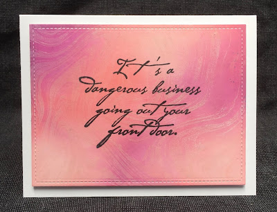
Top:  Background - My Favorite Things Marble Background; Colors - Tattered Rose, Abandoned Coral, Seedless Preserves

Bottom:  Background - Simon Says Stamp Circle Doodle Background; Colors - Shabby Shutters, Peacock Feathers, Faded Jeans

When I make more of these in the next day or so, I'm going to use the technique from the top card:  Ink the panel, and then stamp the background stamp using the lightest color from the background.  Because the ink has pigment qualities as well as dye ink properties, the light color will stay visible on top of the darker shades.  Unexpected!  I think it makes a better, subtler backdrop for the words.

And I had no idea until I told my husband about these cards that this phrase is really a paraphrased quote from Tolkein.

Tomorrow:  Super-quick cards!