Friday, September 15, 2017

Summer thanks...

You'd think with all of the craft products I have in my craft room that there's enough in there to feed a lifetime of crafting activities.  And you'd be right about that, of course.  But still and all, periodically I get on this tear where I have something, and eventually, happily, I give in, and shortly thereafter, a lovely package appears at my door.*

Recently, Craig asked me to make some thank you cards for the people who had stayed with him while I was away this summer.  I saw it as the perfect opportunity to not only get some quality time in my craft room, but also to use some recent purchases from over the summer and try out some new (to me) techniques with watercolor. 

I think I'm the last person in the stamping world to get on the watercolor bandwagon, but like so many others, I've been inspired by the videos of long-time card-making experts Kristina Werner and Jennifer McGuire, and more recently by Cathy Zielske, who is a long-time scrapbooker, but a new-ish card maker.  I have different aesthetics from all three (though I love Cathy's sassy sentiment stamps!), but their design sense and the tone of their videos is amazing.  And I love that peek into the community of the elite of the stamping world, which seems far away, yet real and friendly and supportive.

So, my cards...

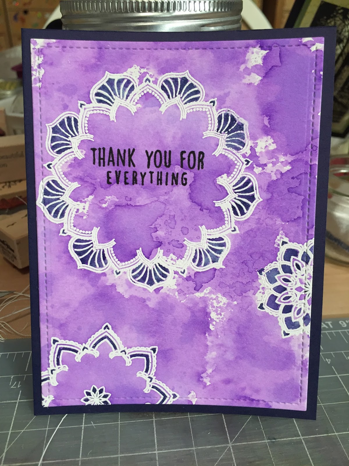
At some point I fell in love with Concord & 9ths Many Mandalas stamp set.  I don't gravitate toward circular images a lot, but I love the kaleidoscopic effect of these images and how they can be used together or separately, and colored in, or not, to create backgrounds or focal images or simple patterns.  I also love that they are 9-pointed stars, which I didn't realize right away.

So, with my Misti, a container of white embossing powder, some sticky Versamark embossing ink, an almost untouched pad of watercolor paper, and my new-ish heat gun, off I went.  Once I had stamped the images, I explored color variations, and at the same time, tried to figure out how to use the "smooshing" technique for a quick watercolor background and how to use a water brush for the details.  And after many stages, color trials, and hours with purple and blue ink on my hands, I had 14 cards.

So many shades of blue and purple to choose from!  Somehow, my cards are always blue and purple.  Shock.
At first, I just colored the center of the largest mandala...
...and then I realized that I liked the effect of a more solid-colored background
Thank goodness for the Misti, which helped me quickly add sentiments, and even re-stamp the largest mandala after I learned the hard way that you need to stamp an image 2-3 times in order to get a clean image on watercolor paper you can then emboss. 
Most of the cards look like this:  A2-size, simple stitched border.
But at first, I cut the cover image down a little smaller, and then hated it.  But finally, I decided to see if I could salvage the smaller cards and mounted them on navy duplex paper.  And of course, I like them a lot better than the others, but just couldn't stomach the idea of taking ten cards apart, re-cutting, and re-mounting them.

Lessons learned:
  • Smooshing - I sort of like it, but don't really have it yet.  I think I want to try again with more color variations over smaller portions of a card.  And I like the idea of an artful, messy, outside-the-lines watercolor wash, but I don't know if I'm really that person.
  • Watercolor brush - yes!  I love it!  And combined with heat embossing creates raised lines that contain the paint into small areas, it's perfect for me.
  • Versamark and watercolor paper - ink twice, at least.
  • Many Mandalas - beautiful.  I just bought the coordinating dies for the images.  I think these would make the best mobiles.
  • Finishing - I'm getting better at making prototypes of cards, and giving myself permission to make many versions of something before I even attempt a real final version (given enough time - ha!), but I need to take my prototype all the way to the end, including final trimming and mounting.
 I hope I get some crafting time this weekend - so many cards to make!!

*At some point recently I realized what some of my need for more craft products was all about.  Some of it is just that there are wonderful products out there on the market and appearing all the time, and I want to use them for my card-making.  A bunch of it is just the regular myths of retail therapy - buying craft things as retail therapy, or to make me feel creative, even though I don't have time to play.  But a bunch of it is the anticipation of something wonderful arriving or waiting for me when I get home in the midst of a challenging environment.  Food for thought indeed...

Wednesday, June 21, 2017

Explorations...

I got home one evening this week swearing to myself that I'd take one hour in the craft room, one hour to do other things, and then get to bed earlier.  Three hours later...

Whenever I can find the time, I read papercraft blogs and watch videos to learn techniques and get ideas from others.  And while I'm always happily behind the curve in all of the latest stamping and card-making fads and product purchases, I have a list of things that don't seem too time consuming or too messy that I've been eager to try, and a couple of recent purchases that have helped me down this road.

1)  Water-coloring:   You can't go anywhere in the papercraft world without hearing about coloring of some kind - adult coloring books, Copic markers, watercolor, and on and on.  I don't really have the time or the patience for coloring itself, and I have been reluctant to go down the watercolor path because it a) requires different paper, b) is potentially messy and leaves a messy look on your card front I'm not sure I love, and c) needs time to dry that I just don't have.

But the more I read and watched, the more I began to see that there might be something to this watercolor business that might work for me.  So months ago, I bought a small pad of water color and did nothing with it.  Finally in March, I played a little bit...

I read about a technique, not where you paint with actual watercolors on paper, but where you ink an acrylic block, spritz with water, and press the paper on top.  You can let it dry, or heat it with a heat tool to help it along, and once it's dry, stamp over it.  This is marginally messy and time consuming, but not really moreso than everything else I make.


The background does have that messy look, but I like the contrast with the crisp black stamping on top (I finally got a great black ink - this also makes everything better!!!)  I liked my first attempts above, but left it there, and didn't even make the images into cards.

Then sometime in the past week or so, I read about a technique where you ink up a piece of watercolor paper with Distress inks, which are designed to react with water, liberally spritz a stencil with water, and press that stencil down over the inked sheet with a paper towel on top to absorb the excess moisture.  I can't for the life of me find the source, but I remembered the technique and gave it a try using a new stencil from A Colorful Life:  Island Flowers.


This is one of a bunch of similar techniques with ink, stencils and watercolor.  You can put the dry stencil on top of the inked paper and spray with water.  You can put the stencil on the un-inked paper and ink or watercolor over that, and on, and on.

My results were subtle, and brighter in real life than in this photo (also note this unusual color palette for me - yellow! - craziness!).  I want to try this again with darker colors and different stencils, and even bringing the paper to the wet stencil instead of stencil to paper to see if the effect changes.  Here's a look at the full card:


2)  Heat Embossing:  Okay, I've known about and done heat embossing for a long time.  That's where you stamp something and while the ink is wet, cover the image or sentiment with embossing powder, shake off the excess and heat it with a heat tool to melt the powder, which produces a raised image.  I feel like I did a bunch of this back when I first started stamping, and then mostly avoided it because it added an extra step to my card making, and because I wasn't very good at it.  I never knew whether my ink wasn't sticky enough, my embossing powder of sufficiently poor quality, or my heat tool not up to par, or all three.  But like watercolor, it seems like these days all cards and techniques involve some heat embossing, so I decided to give it another go.


I made this card in May.  If you look at a close-up of the image, you can see the embossed image, which resists the ink over it.  And if you look really close you can see (or maybe you can't and I just can because I know it's there), uneven spots.

So at some point this month when Amazon was calling to me with its siren call, I added a new heat tool that looks less like a hair dryer, and has a stand to use when it's heating up, and a pointed nozzle to help you direct the heat exactly where you want it.  It's also powerful and heats up quickly, and for both the embossing and for drying my watercolor, it was fantastic.  Here's a close-up of my embossing - still imperfect, but faster!


Also notice the use of the stitched boarder frame die, which cuts the cover card piece to an exact A2 size with straight lines and everything, and include that notched line just inside the edge.  I often find I want a subtle border around the edges of my card panels.  I either use a tracing wheel, or draw pencil lines, or use a marker to create a border.


The stitched dies, which everyone in the card-making world already has, and I guess is done using, help achieve that same affect.  I'm in love with them.

I hope I can keep finding time to experiment and make things as the summer goes on.  One of these days I will be brave and tackle embossing paste!

What are you working on this summer?

Wednesday, June 14, 2017

Colorplay

You'd be amazed at just how often I mean to post to this blog...  I have a big list of topics for posts, and photos even, but the absence of time.  So for all two of you who will see this, maybe there will be more coming.  Maybe I'll even post again this year, or this season!

I try to make a habit of documenting all of the cards that I make.  In the olden days, I would splurge on a color copy of the card and be satisfied that the image captured the idea of what I made, if not the exact colors.  These days, my phone goes up to the craft room with me so I can take a quick snap when I have a final product.  And more often than not, I take another shot of the card at my office where my cube is full of natural light in the mornings.  I recently made a birthday card and photographed it twice:


I know it's just science, but I find it amazing how the different lights make the colors appear different - warmer in the view on the left, shot at night in a room with dark walls lit by halogen and (maybe) incandescent bulbs, and more yellow on the right, taken in the light of my office window with some fluorescent overhead. 

So what color is it really?  I guess now only the recipient will get to decide...

Card Details:  Tim Holtz "Tiles" stencil with Distress inks; Coffee Bean stamp by Stamps by Judith & Heather; Sentiment by Tim Holtz for Stampers Anonymous "Saying Stuff set"