Wednesday, November 13, 2019

Woodblock Wednesday, take 1...

I saw a blog post the other week under the heading of "Woodblock Wednesday."  The idea was to create a card using stamps in your collection mounted on woodblocks.  I love this idea because it encourages you to use the older stamps in your collection, rather than always reach for the newest stamps closest to hand.  I have so many woodblock stamps that I adore, but don't reach for as frequently these days because the clear stamps and cling stamps are just so much easier to store and use, especially with the help of the MISTI.  I can't believe I've gotten to this point.  I remember back in the day when I would never even consider buying an unmounted stamp.  Look at me now...

I decided to take this challenge to a new place:  not only to use woodblock stamps in a card each week, but to use this as the opportunity to convert the woodblock stamps to repositionable cling stamps in hopes I might reach for them more often.  Here's my first card in this series, sent to a friend to thank her for hosting me over a dance weekend:


Image:  Picture Show; Quote:  Renaissance Art Stamps; Diecut frame:  Spellbinders

Thursday, September 19, 2019

Card promts: Style

I love it when key things coincide:  a card-making challenge with a prompt that resonates and the time to do something about it!  This week, Addicted to CAS (Clean and Simple) presented the code word "style."  This is right up my alley, falling right into my usual card formula.  I made two cards even!

Image:  Moon Rose; Sentiment:  Rubbernecker Stamps

Image:  Scarlet Empress; Sentiment:  my custom version of a stamp from Rosie's Roadshow

Monday, August 26, 2019

Hey gorgeous...

I fell off the card-making wagon during dance camp season, but I finally got a little time in the craft room this weekend!

Last week I watched a Jennifer McGuire video about a technique she calls the embossed watercolor lift.  The short version is you watercolor a background, stamp and clear emboss a background stamp over the watercolor, and then use water to fade the color.  The stamped image under the embossing retains the original color while the rest of the background color begins to fade away leaving a cool effect.

This technique was a great thing for me to try for a number of reasons:

-I'm not short on background stamps
-I'm very much a watercolor novice, and I love the look of it, so I keep trying to practice
-I've noticed that many card makers make lovely backgrounds, and then just pop a sentiment over it, and voila!  They have a great card.  This has rarely been my way.  I tend to focus on the image, and make that fit the sentiment, or the intended recipient, or the occasion in some way.  It was a good exercise for me to just make a background and not overthink it.  Not too much, anyway.


I used Stormy Sky, Chipped Sapphire, and Seedless Preserves Distress inks, and an old Marvy dye ink pad - Plum or Wine, I forget which one.  I stamped and embossed the Gibson Girls Background from Lost Coast Designs, and then used a paintbrush to wipe away a bunch of the color. 


The paper was quite warped by the end of this, but using a stitched rectangle die was great for making it flat again.


Finally I added the Hey Gorgeous sentiment from Pinkfresh Studio (three layers in black over vellum).

This was a fun technique to try.  Using my heat tool was a huge time-saver in-between steps.  Next time, I'll try a different watercolor background - stripes of color was a stress free way to begin, but my guess is that just like acrylic block watercolor backgrounds, once you do the over-stamping, most background color imperfections fade away.

In other crafty news, I visited a new-ish craft store not too far from my house over the weekend:  Creative Inkling.  I know one of the two of you who reads this wants to take a class there with me sometime.  Valentine or holiday card making retreat, anyone???

Friday, July 12, 2019

Card formulas...

I was watching a May Park video the other week where she mentions a favorite card formula - a go-to design that just works but is infinitely variable as you change images and ink colors.  This is what I crave in card-making, fashion, meal-planning, dance program-writing - everything - something simple that just works, that I can turn to again and again.  Here's a basic card design I love:


Formula:  Image, often on the left side, some kind of (often snarky) quote or sentiment, simple border.  I made this one a few weeks ago, took a deep breath, and sent it to my mother.  Image:  Red Castle Stamps; Sentiment:  River City Rubber Works

Looking through my file of scanned cards, I turn to this formula again and again...


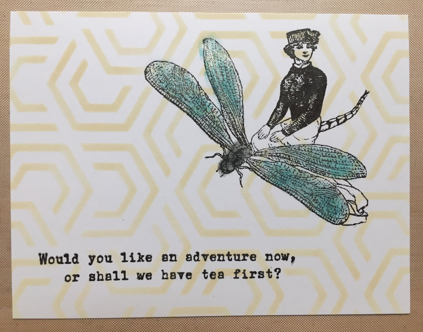
I made this one right after I got home from a stamp convention with some just-purchased products.  In a daring move, the image is on the right side!  I used a stencil for the background and lightly colored (and added sparkle to) the image.  Image and sentiment by Character Constructions; Background stencil by Neat & Tangled.


I know I've had this stamp forever!  And look at me attempting some watercolor!  Stamp:  Woman with Cup by David Walker for Uptown Rubber Stamps; Tea Packet sentiment - Stampington (it's not this one, but a similar one...).


I will probably never have enough Gibson Girls in my rubber stamp collection!  Here I stamped the image and sentiment, and then sponged some ink on top.  Image:  Flonz; Sentiment:  custom stamp I had made based on a much-loved button not unlike this one.


It turns out I have two rubber stamps with this same sentiment.  This is one of a pair I made.  Image and sentiment by Technique Junkies.


This is one of a series of cards I made for my favorite place in the world, riffing off of their logo.  Image:  Stampscapes; Sentiment:  Stampa Fe


And finally, a valentine from several years ago.  Image:  Moon Rose; Sentiment:  Just for Fun

Thursday, July 11, 2019

Portable crafting...

Summer is a time of traveling for me (Dance Camp!!), and brings with it all kinds of wishful thinking like I will have so much time for reading - I'd better take at least three books with me, and my Kindle, just in case.  And then I manage to only read a few pages from one book each night before falling dead asleep.  Crafting on the go is another one of these things aspirations.  I imagine I will have lots of downtime for working on a project, or making random things.  So I dutifully pack too many supplies, because I can never decide ahead of time what to work on, and maybe get an hour once, or not at all.

Last summer, in an attempt to not carry so much (as if), I focused on wreaths and the wreath builder system from GinaK Designs, and I actually made a few things I didn't hate.


People are making beautiful wreaths out there, and I aspire to that, but I find my success rate is mixed.  But I do love the idea of wreaths or other geometric designs not made out of flowers.  This is one I made last summer with a bunch of small stamps from the Stampendous Charm Collection.  I love the monochromatic simplicity of it, and the surprise when you look closely and discover the small images that make up the whole.  Someday, I'll actually turn this into a card.

I'm going back to camp in a few weeks.  Oh, all 1-2 people who look at this, what should I work on this year?

Monday, July 8, 2019

Recurring themes: Cityscapes

This is a post I started writing in 2015 and have been meaning to finish ever since... 

I find I have inadvertent themes in my stamp and die collection:  background stamps with script/French/indecipherable writing, Gibson Girls, mail art and faux postage, snarky quotes, sassy women, moose, oceans and water, and on, and on.  Another recurring theme: cities and skylines. Maybe it was growing up in New York City, but I find drawn images of buildings, towns, cities, city maps, row houses, etc. alluring. When I finally added cutting dies to my collection, I had to have all of the cityscape dies. 


This 4th of July, I played with a few new purchases:  a cityscape die from Ellen Hutson and a fireworks layering set from My Favorite Things.  I dragged out my ancient embossing powders and chose a few of the best metallics.   If/when I do it again, I'd use a transparency to plan out the fireworks a little better - may putting one burst below the skyline, adding a few more, and thinking about placement and balance - always a challenge for me.

I have this someday project of cutting all of my cityscape dies, and stamping all of the city stamps and looking at them side-by-side.  I wonder how many of the dies in particular would look identical?

Stamps:  Fireworks by My Favorite Things
Die:  Big City by Ellen Hutson
Inks:  Versamark and Tim Holtz Distress Oxides

Friday, July 5, 2019

This could be vodka...

My grand plans for the July 4th holiday involved making at least five cards.  At least!  Which means I made 1.5...


I saw a card using this stamp set on Coffee-Loving Cardmakers, and thought about it for a long time before ordering the set from Cat's Pajamas recently.  The set features two of my recurring card themes and stamp purchases:  coffee/tea related stamps and saucy/sassy/snarky/wry/irreverent (which is the best descriptor???) sentiments.

I also wanted to practice with my watercolor markers, so I just stamped and embossed a bunch of images, and used my favorite for this card.  And look at me actually using some rhinestones I got for free with a stamp purchase a year ago.  I like a clean and simple card, but this one needed something.

Thinking about the card again this morning, if I were to do it over, which I might, I would leave the mug plain, or stamp or pattern piece a design on it, and then stamp the image with the sentiment in the same location on the inside of the card, leaving the sentiment as a surprise for the recipient.

Stamps:

Image:  This Could be Vodka by Cat's Pajamas
Background:  Love of Coffee by Picket Fence Studios