The key to success for me was to find a simple design that I could vary just enough to make different sets of cards, but that would be easy to reproduce.
What I came up with were single images, mounted on colored card stock, mounted on white A2 folded cards with a simple, single-line pencil frame. I had sets with cooking utensils, clocks, shoes, yarn, etc. In some sets I included multiples of the same image. In other sets I had two each of three images, or three each of two. I sold more sets than I thought I would, and came home with about $50 and less than half of my inventory. Success!
Last year I wanted to try and sell off my remaining stock and add some new designs, but never got to it. So now it's one month until camp, and I'm off into production mode (as well as camp prep) again!
Last fall I had this idea of creating a series around one of my favorite stamps from the Moon Rose, and pairing that image with various quotes. This concept led to this year's valentine:
But I found that when I stamped out all of the quotes I had in my collection that I thought would work with this image, they didn't all work visually. Either the font was wrong, or like the card above, the pairing of image and quote didn't fit on an A2 card, which is my go-to size for cards. In the last couple of weeks, coming back to this series, I hit upon what I wanted to do: limit my cards to 3 or 4 different images, and pair each image with a different quote. I played around with the placement of figure and words, and came up with these three prototypes:
 | |
| Figure: Moon Rose; Quote: Just For Fun |
 |
| Figure: Silver Crow Creations; Quote: Inkadinkado |
 |
| Figures: Picture Show; Quote: River City Rubber Works |
I wanted to add a dash of color to each design by masking the figure, and using a stencil to stipple in some color behind (see this post on my attempt to use a pre-made mask...). I used the excuse of needing a card to send to a friend to make my first full card.
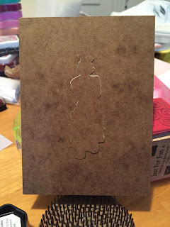
I used a stamp positioner to put my image in the right place.
I masked the image and used Tim Holtz's Dot Fade stencil to add color.
I made just a small error when I added the quote, so I started again, which allowed me to make the image and quote square up with the card - little errors like that really annoy me.
Voila! I think I may leave it at that. I used a Color Box chalk ink in Rose Coral, which shows up better in reality than in the photo. I am resisting the urge to add more color or a border or both.
For the other cards, I will either use the same stencil and a different color, or a different stencil and the same color. I want the set to have some unifying features.
I'll keep all one of you reading posted on my progress and the success of my sales!


