Showing posts with label Themes. Show all posts

Tuesday, July 14, 2020

Be strong...

I spent hours making a card on Saturday.  It's really a treat to have that much time for crafts, though it never ceases to amaze me how long it takes me to make anything! 

I like the card.  It came out nicely, and I'm going to put it in the mail today, but when I look at it, it looks fun, but unremarkable.


What actually does make it remarkable for me is that so many things successfully came together to make the card possible.

1.  The idea.  I happened to catch a card posted by Coffee Loving Card Makers on Facebook or Instagram, I can't remember which.  The card is by Richard Breaks, a crafter I just started following.  He used this sentiment built from a Honey Bee Stamps set called Perfect Blend.  I was struck by the simplicity of it.  Be Strong, be bold.  To my mind, it's a perfect pairing with coffee-themed cards.  With all of the coffee and tea-related stamps in my collection, I've been wanting to make more coffee cards for ages.  So an idea was born.

2.  The card shape.  Slimline cards are a popular new/old idea in the card-making world.  I'm not completely sold, but I wanted to try a few - lord knows I have plenty of business-sized envelopes to send them in.  I liked the first one I made...


...but I didn't even take a picture of the final version.  The kitties themselves were fun and easy to make, but cutting the layers was a nightmare of not quite straight or perpendicular lines.  This is why I buy frame dies - they take the guesswork out of cutting layers, and increase the chances I will like something I make.  After struggling with my kitty slimline card, I bought a set of slimline dies from Trinity Stamps.  They arrived on Friday, and part of making this coffee card work involved testing the dies.

Now, I sometimes have an adversarial relationship with my die cutting machine, but I've figured out how to make it work most of the time, even though I hold my breath every time I send something through.  The thing is, the machine is small-ish, and has cutting plates that are almost, but not quite long enough for the new slimline dies.  Yes, I could do partial die cutting and run the stuff through the machine twice, but that adds to the likelihood that something will go wrong.  But this is me, who hangs onto things long after she should.  I saved my long Cuttlebug cutting plates that hardly ever got used in the long-gone machine because I thought they might be useful someday.  On Saturday,  I dug out the almost pristine long plates, played with the arrangement of plates and shims until I got my slimline dies to cut in one pass.  Victory!

3.   Stamps and dies.  I knew I wanted to use big coffee cup images for the card.  Since I have most of my stamps cataloged and tagged in an online database, I simply plugged in the keyword "coffee", picked out a few likely candidates, and compared the size of the images to the size of the three card windows.  I landed on this set from Cat's Pajamas called This Could Be Vodka.

Most of the time, when I buy a stamp set, I buy the matching dies.  I struggle with fussy cutting out an image the way I struggle with cutting straight lines for card panels even with a paper cutter, ruler, and everything else.  For all two of you who read my last post which touched on this topic, my chosen set for the coffee card had no matching dies for the full images of critter plus cup - no physical dies, that is.  But I actually found and bought an on-sale digital cutting machine about a month ago, and last week, bought (for zero dollars!  Hooray) the digital cutting dies that matched.  I'd been nervous about trying the digital dies the way I'm nervous about trying many new things, but I'd rather try than have the machine sit around and collect dust.  And wouldn't you know, after watching many tutorial videos over a few days, I uploaded the cut file, chose the correct settings for the paper I was using, and the dies cut perfectly.  Victory!

4.  Coloring.  Another thing I work at, but am less good at.  As I was getting excited about my digital dies actually working, and getting my stamps all lined up and stamped out, I was thinking about how to color the cups and the critters.  As I was clearing up some scraps on my work table, it occurred to me try paper piecing patterned paper onto the cups.  As it happens, I do have dies that match the cups only, so I took a quick wander through my endless amounts of paper scraps, and found a piece of patterned paper that came with a magazine I bought years ago, and cut out some cups.  And even though it's not a palette I gravitate toward, I found a coordinating color for the mat behind the windows and a matching marker to use for the cup handles.  I made the bold choice to keep the critters white.  I'm fine with that decision.

If there's one thing I would change on the card, it's the sentiment.  The two sentences should at least be closer together.  If I end up doing a coffee card series, I might use the same sentiment again, so I'll have a chance to play with design and placement.

Tuesday, April 21, 2020

CoronaCrafts - Call of the Sea...

Ugh!  I've been so good about blogging regularly during this time at home, and then boom, a week goes by.  Silly me for trying to take more time away from this little screen...

Last week, I was looking at Ebay, like you do, and searching for Gibson Girl rubber stamps, like you do, when I came across one I didn't have - which seems almost impossible.  As I was considering making the purchase, I looked at the seller information.  The seller turned out to be a rubber stamp store that used to exist in Connecticut.  When I had extra time on my way up or down the NE corridor, I would sometimes take a detour and visit that store.  The last time I tried that, which was several years ago now, they were gone like so many.  But here they are again on Ebay, no doubt selling off their inventory.  Before I purchased my Gibson Girl with Hat stamp, I decided to look at their other offerings.  I mean, who can resist the siren song of combined shipping???  My one other purchase:  a Van Gogh quote about the sea in my favorite almost unreadable scripty type by East Coast Art Stamps, a company I've never heard of that I know is long gone.  The two woodblock stamps arrived on Friday and I was inspired to use the quote stamp immediately.


I knew I wanted to pair this quote with an ocean image, of which I have many, and I chose this layering set by Papertrey Ink:  Text & Texture:  Ocean, which I hadn't yet tried.  I always struggle with choosing colors, so over the weekend, I took a few hours and just tried this stamp set a bunch of times with various shades of green, teal, and blue. 


I did something novel and even wrote down the color combinations so I could have a visual aid for next time.  Crazy, I know.  I went with two shades of teal from the Altenew Sweet Dreams set:  Teal Cave and Galactic Stream (the names make the colors extra special...).


My plan for the quote was to stamp it on white translucent vellum, let the ink dry for a million years, run it through my sticker maker thing, because all pieces of tape and drops of glue are visible through vellum, and then put the whole thing together.   Such a simple plan, really.  I stamped the quote on two pieces of vellum just to be sure I had an extra when I screwed up one of the pieces.  PS, I messed up both pieces in different ways.  After waiting about three hours, I ran the first piece through the sticker maker and smudged all of the ink.  After waiting about 15 hours, I tested the ink on the second piece, and smudged it.  Time for another plan.

I cut another couple of pieces (this is when I discovered I was down to my last sheet of white vellum), ran them through the sticker maker first, then stamped, and then clear heat embossed the pieces so I could finish the card before quarantine ended.  But alas, clear embossing, while it made the piece usable, thickened the text, making it more arty than readable. 


I still like the concept, and still sent the card - if it was a disaster, the card would still be in the house - but I plan to remake it.  Next time I will try a) using dye ink on the quote, which dries faster, b) waiting at least 24 hours before touching the vellum, c) positioning the quote closer to the bottom of the card, and d) adding more color to the sky - you almost can't see it in the photo.

The quote calls the Mediterranean Sea the color of mackerel, like a mackerel sky, I guess, but meaning changeable in color.  Maybe I'll try get some of that color variation into the ocean...

Thursday, March 19, 2020

CoronaCrafts - Day 4

I've mentioned before that I gravitate toward certain themes in the stamps and dies I buy and the cards I create:  coffee, Gibson Girls, women and snarky sayings, city skylines, etc.  Another of these is oceans, waves, and waterlines.  I love swimming, seafood dinners, river boat tours, ferry rides, and the like.  Today's card celebrates that love.


The showpiece of this card is the Layered Wave die set from the Ton Stamps.  It's amazing.  I'd cut out a few pieces from various shades of blue forever ago, but never used them because I wasn't quite sure what to do with them.  So I went back to the Ton's website and took a cue from one of their card examples just to get me started.  I even found the remants of the blue paper I had used before, and cut out a few more wave pieces, just to give me too many options.  Now that I watch the video on the Ton's website again, I might follow their example more closely next time.

I cobbled together a sentiment mostly from Technique Junkies.  At a stamp show some time, I got a grab bag of stamps from them, which included "Meet Me," and "the Sea."   I scoured my collection for anything containing the word "at" and found one.  I took my time lining up the words, and silver embossed each one.

Though very imperfect, this card, and these wave dies are amazing in person.  They would be great for a diorama or shadow box card, or over vellum, or paired with one of my layered ocean stamp sets! I have to use these dies again, so send your ideas.

Tomorrow:  Here comes trouble...

Friday, July 12, 2019

Card formulas...

I was watching a May Park video the other week where she mentions a favorite card formula - a go-to design that just works but is infinitely variable as you change images and ink colors.  This is what I crave in card-making, fashion, meal-planning, dance program-writing - everything - something simple that just works, that I can turn to again and again.  Here's a basic card design I love:


Formula:  Image, often on the left side, some kind of (often snarky) quote or sentiment, simple border.  I made this one a few weeks ago, took a deep breath, and sent it to my mother.  Image:  Red Castle Stamps; Sentiment:  River City Rubber Works

Looking through my file of scanned cards, I turn to this formula again and again...


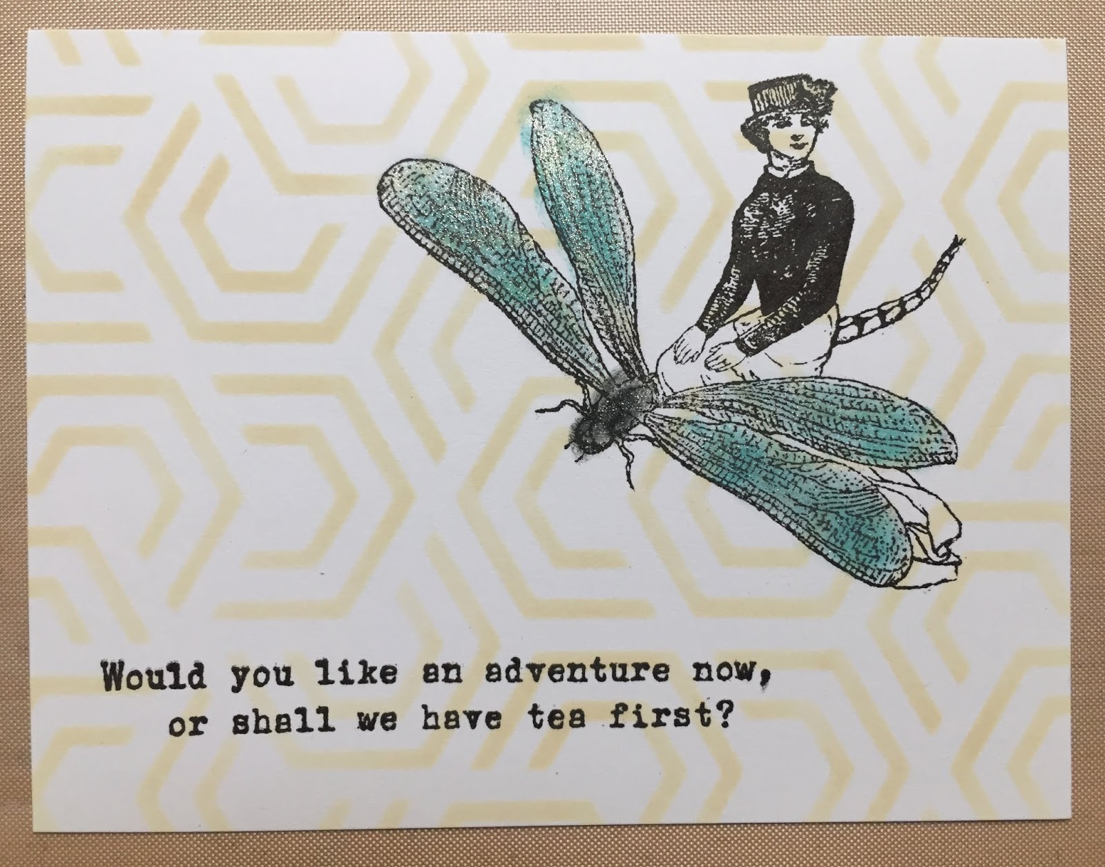
I made this one right after I got home from a stamp convention with some just-purchased products.  In a daring move, the image is on the right side!  I used a stencil for the background and lightly colored (and added sparkle to) the image.  Image and sentiment by Character Constructions; Background stencil by Neat & Tangled.


I know I've had this stamp forever!  And look at me attempting some watercolor!  Stamp:  Woman with Cup by David Walker for Uptown Rubber Stamps; Tea Packet sentiment - Stampington (it's not this one, but a similar one...).


I will probably never have enough Gibson Girls in my rubber stamp collection!  Here I stamped the image and sentiment, and then sponged some ink on top.  Image:  Flonz; Sentiment:  custom stamp I had made based on a much-loved button not unlike this one.


It turns out I have two rubber stamps with this same sentiment.  This is one of a pair I made.  Image and sentiment by Technique Junkies.


This is one of a series of cards I made for my favorite place in the world, riffing off of their logo.  Image:  Stampscapes; Sentiment:  Stampa Fe


And finally, a valentine from several years ago.  Image:  Moon Rose; Sentiment:  Just for Fun

Friday, June 21, 2019

Seeing what happens...

I find it so easy to be stymied when I don't have a specific project in mind, or an intended recipient for a card.  Last night I reminded myself that the only way to get past that is by doing the work - just put stamp to paper, and something will happen.


This card started from me just stamping out a couple of stamps from a new-to-me set on some scrap paper, just to see what they looked like.  It's simple, which is completely my style, but I might try this one again and see if some pale coffee rings works as a background, or detracts from my focal image.  The inside reads:  Coffee is my love language.

All images and inside sentiment:  Coffee Talk by Joy Clair.

Wednesday, January 13, 2016

Recurring themes...

Happy new year, all two of you who read this blog!! 

One of the long-term projects on my list is to get a new monogram stamp to use as a signature or logo for the back of my cards.  I have different initials than I used to, so my perfect monogram peg stamp made by the now defunct Stamp Cabana no longer does the job.  Of course there are many companies who will design and make a monogram stamp for you, but better than that, my husband offered to design one for me.  This led to the problem of having too many options:  what size did I want, what font, how readable, graphics, or none, and on and on.  Having too many options brings me to a halt, so though I've had new initials for a while now, I still have no stamp.  But it's the new year, so it's time for a decision and progress.

To get me on the right track, I recently started to think about what I liked about the current monogram stamp I have.  It's small, about 1/2" square, simple, with two initials intertwined, and uses a kind of Art Nouveau-esque font.  Internet searches of Art Nouveau and Art Deco alphabets led me to fonts which resonated with me.  From there it was a very short hop to the artwork of Charles Rennie Mackintosh, who's work I studied in school.  This led to another connection - I already own a bunch of craft stuff in this style and gravitate toward those stylistic Glasgow roses.  Searching in my craft room last night, here's what I pulled out:


The products:  Acey Duecy stamp - Palazzo; Rubber Stamp Tapestry Stamp - Single Rose-SmallSpellbinders M-bossabilities - Cabbage Roses; Tim Holtz Layering Stencils - Scribbles; Poppystamps die - Art Deco Roses

In my head, the roses in all of these products looked identical.  Not so, of course.  I decided to see if and how they all worked together.  I used plum dye ink on cream paper for with the stencil.  As the pattern is called scribbles, perhaps that's what the designer sees, but I always see roses.


Using a similar palette, I stamped out the two images, and decided that the peg stamp was sufficiently different to not make the final piece.


I used textured paper with a white core in the embossing folder, and sanded off part of the paper to try and make the roses pop.


But in the end I decided that I like the solid coloring best, so used the debossed side.


My die cut corner was the final piece.  Here's how they all came together:


This card was just an exercise and an experiment with some new and old products.  In the end, I liked the pieces individually, but not how they came together.  The design developed organically, based on the scraps that were closest to the top of the pile on my desk, not with any forethought.  If I do something like it again, I'll think about the size and color of the pieces more carefully. 

I love the die cut especially, and hope to use that often, but I need to work on how incorporate it in a larger sheet without adding bulk or too many layers to the card, and more important, how to glue it down (If you look closely at the image above, you'll likely see tons of residue from the adhesive, and the oh-so-attractive visible bits of double-face tape beneath the two roses on the lower right.  One of these days I'm going to have to bite the bullet and go back to glue.  Suggestions???)

In the end, what struck me is how my collection of craft products is consistent, even in its breadth and age.  I have these mini themes that wind their way through my stamps, papers, and now embossing folders, dies, and stencils.  Maybe this just shows how little my tastes have changed through the years.

I have a long list of topics for this and my oft-neglected companion blog Festive, Yet Tasteful, so check-in from time to time, and share in the comments what projects you're working on this year.